
👉 Are you accessible? 👈 — A Primer on Web Accessibility
Accessibility of the world wide web hasn’t always been a number one priority for web developers (much to detriment of internet users). Whilst very few people set out to design a website that is inaccessible, many studies have documented partially or completely inaccessible websites [1].
There are many reasons why this is the reality, here are just a few:
-
Out of sight, out of mind: this idiom is very apt for web accessibility. Developers who have never encountered browsing the web through assistive technologies simply don’t think about accessibility as part of the experiences they are building.
-
Web developers don’t know enough about web accessibility standards (which is complicated by the existence of multiple standards)
-
Web developers lack tools for evaluating their websites
-
Sometimes content is provided by third parties (like advertisements which may be inherently inaccessible)
-
Evaluating websites for accessibility can be a HUGE undertaking
-
Web developers aren’t Assistive Technology (AT) experts
-
Drag and drop website authoring tools often don’t support accessibility
Considering even just a few of these points you might understand why web developers have stayed away from tackling the “accessibility issue”. Often, when I talk to others about why it is important that we DO tackle this problem, I cite a comic that was introduced to me at IBM’s workshop on accessibility at the Grace Hopper Celebration in 2017 (shown below).
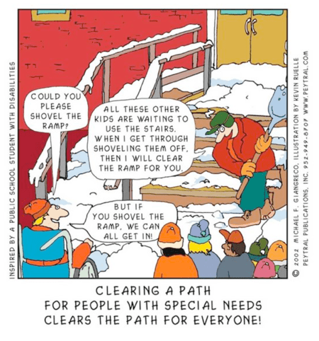
Accessibility is important to EVERYONE, not just the users accessing your site through assistive technologies.
In this post I am going to unpack what it means to be accessible on the web. We will cover:
-
The specifications and guidelines for the accessible web
-
Best practices for website accessibility
-
An extensive (but not absolute) resource list to get you started
Following on from this post I will be writing a series of posts about making samsunginter.net more accessible — in which I will walk through a case study of reviewing our blog site and the efforts we are taking to build with accessibility in mind.
Disclaimer
As a researcher I have spent the last three years working with people with all kinds of disabilities; conducting user evaluations, field studies and other research activities. This post has been created to provide guidance only — the recommendations made are developed from my own personal experience in my research and in navigating the accessible web space.
Glossary of Terms
-
A11y — this stands for Accessibility (because there are 11 letters between “A” and “y”) and is a play on ally used by people working in accessibility. It is not a term limited to the technology sector.
-
Assistive Technologies (AT) — hardware and/or software that provides services to facilitate user interaction with web content for people with a disability.
-
Alt-Text — This stands for Alternative Text, which is presented to assistive technologies in place of images.
-
**HTML **— Hypertext Markup Language, the standard markup language used for creating web pages and web applications.
-
**CSS **— Cascading Style Sheets, a style sheet language used for describing the presentation of documents written in markup language such as HTML.
-
**Gif **— Graphical Interchange Format, a popular image format that supports animation.
-
Keyboard Focus — Keyboard focus determines which window or control will receive information from the keyboard.
A side note on Disability
It is important to remember that “having a disability” is not always a permanent state for a person. It’s estimated that 19% of the world’s population suffers from some form of disability in their lives. That’s 1 in 5 of your potential user base.
There are a number of great resources out there that highlight this, here are a few that I encourage you to look at:
-
Web Accessibility Benefits People With and Without Disabilities — Web Accessibility Initiative (WAI)
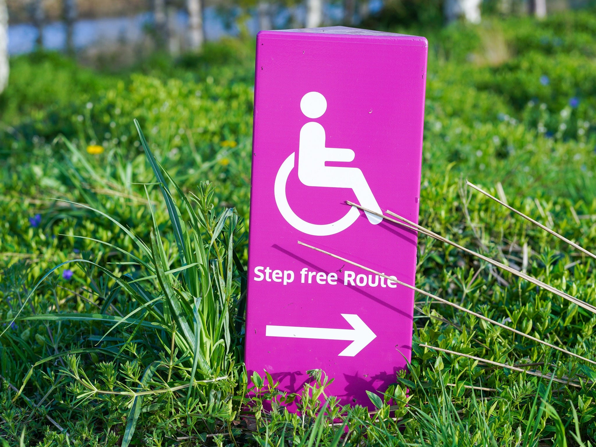 A sign in some grass pointing to the accessible route.
What does it mean to be accessible?
I’m going to quote Katie Cunnigham here:
Being accessible is about making your website, with all of its data and functions, available for anyone, no matter how they have to use your website.
- Katie Cunningham, Accessibility Handbook (O’Reilly) [2]
And as many of us know within the a11y community, the benefits of being “accessible” aren’t restricted to those with accessibility needs. In fact, making accessibility a foundation of your development process can improve your website for all users.
This is why I encourage anyone reading this to look at accessibility as a foundation and not a feature.
Making the Web Accessible — the guidelines
So there are a number of guidelines you should know about for building accessible websites:
-
Section 508 — specific to the United States
-
Web Content Accessibility Guidelines (WCAG) 2.1 — guidelines for the world wide web
-
Web Accessibility Initiative — Accessible Rich Internet Applications (WAI-ARIA) specification — guidelines for web interoperability with assistive technologies
We will also look at some interesting topics and best practices for making an accessible web, including:
-
Semantic HTML
-
Alternative Text
-
CSS & ACSS
-
Auto-semantics
Section 508
If you’ve ever done an internet search for “accessibility on the web” you may have run into the term “508 compliance”.
This was a section of the 1998 amendment to the Rehabilitation Act in the U.S. The amendment required all websites created for the United States government to be accessible to everyone, in spite of any individual accessibility needs.
Section 508 focuses on the accessibility requirements of three main groups:
-
The visually impaired
-
Those with hearing impairments
-
Those with physical impairments
This was an important step in raising the issue of accessibility on the web because many people were being left behind, as the web grew more and more complex.
Developers had started to use things like tables for layouts, which resulted in screen readers not performing as expected, and many other features of the web were becoming inaccessible for different user groups.
You can read the details of Section 508 in full here.
If you want to write 508 compliant websites then I highly recommend Katie Cunnigham’s Accessibility Handbook as it is a comprehensive guide to doing just that.
Web Content Accessibility Guidelines (WCAG)
Another set of guidelines you will find when researching web accessibility are the Web Content Accessibility Guidelines. These are guidelines issued by the World Wide Web Consortium (W3C); which is a body that works to develop Web standards.
The goal of the Web Content Accessibility Guidelines (WCAG) is to provide a single shared standard for web content accessibility that meets the needs of individuals, organisations and governments internationally [3].
The most recent guidelines WCAG 2.1 was published on the 5th June 2018. This recent release of guidelines are “backwards compatible”; meaning if you want to meet both WCAG 2.0 and WCAG 2.1, you can just use the 2.1 resources.
These guidelines are designed to be stable, reference-able technical standards. For ease these standards have been organised under 4 principles: perceivable, operable, understandable and robust. Provided with these guidelines are testable success criteria and these can be met through three levels: A, AA and AAA.
The resources provided by W3C on this are extremely comprehensive — with techniques on how to develop accessible content and how to meet and understand the guidelines. When building and accessing websites for accessibility W3C encourages developers to use the most recent version of WCAG.
You can access everything you need to know about the guidelines here.
Web Accessibility Initiative — Accessible Rich Internet Applications (WAI-ARIA) Specification
Another product of the Web Accessibility Initiative from W3C is the Accessible Rich Internet Applications (ARIA) specification.
WAI-ARIA is a technical specification that provides a framework to improve the accessibility and interoperability of web content and applications.
The focus of WAI-ARIA is on the semantics of the web, something that assistive technologies rely on heavily in order to make sense of how a website should be navigated.
As stated in the WAI-ARIA documentation:
New technologies often overlook semantics required for accessibility, and new authoring practices often misuse the intended semantics of those technologies.
- w3.org, WAI-ARIA 1.1 [3]
Incorporating WAI-ARIA when developing websites gives developers a way in which to provide proper semantics for custom user interface elements that will make them accessible, usable and interoperable with assistive technologies.
Understanding how to properly use WAI-ARIA is important for assistive technologies to be able to interact with your website as you would expect. Improper use of the WAI-ARIA landmarks due a lack of understanding can sometimes produce worse results than not using WAI-ARIA at all. Be mindful of this when you are using it — read more here.
You can find the full specification for WAI_ARIA here.
Making the Web More Accessible — in practice
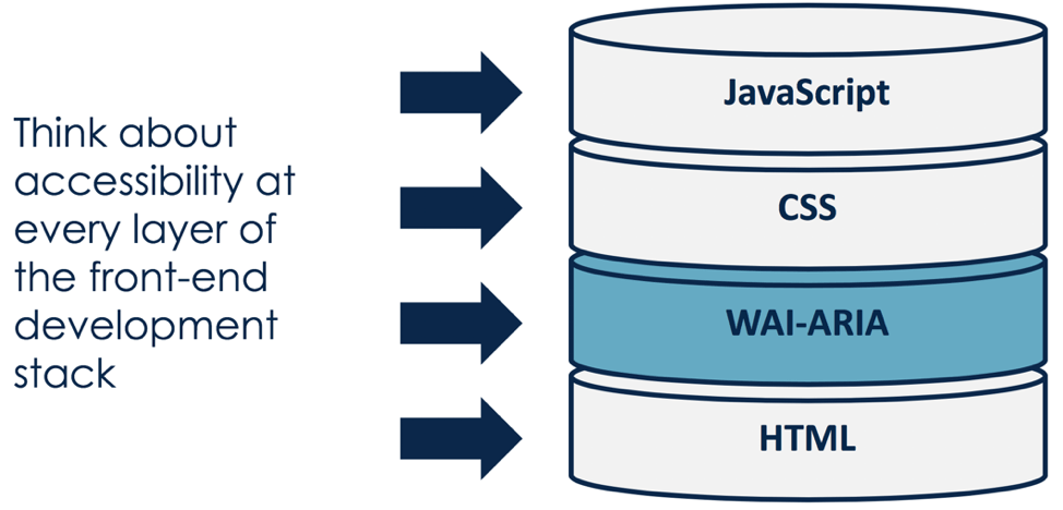
WAI-ARIA and the importance it stresses on the semantics of a website leads us nicely into discussing some of the best practices for making the web more accessible. So let’s talk a bit about semantics.
Semantics is the science of meaning; in this case, used to assign roles, states, and properties to user interface and content elements as a human would understand [4].
Semantic HTML
HTML (Hyper Text Markup Language), which we use to build websites, has built-in semantics which it uses to order elements within the DOM (Document Object Model). When writing HTML the best practice from an accessibility standpoint is to use elements for their intended purpose. But in real life when browsing websites, we can see that this often isn’t the case.
What do we mean by the intended purpose of an element? Let’s take a look at one of the HTML tags that we commonly use, the <h1> tag.
The <h1> element (which we use to insert headings into our websites) is used to identify the most important header of a web page or section of a web page. However sometimes it is misused for the purpose of styling -** a big no no**.
When you use elements for styling reasons this can land you with a website that is almost impossible to navigate using a keyboard. As the common behaviour for keyboard focus is to tab through the headings in order of importance within the DOM.
In the past, using markup to define styles and control the layout of websites was a common practice. However when writing semantic HTML, we should not be selecting elements based on their visual presentation; instead we should select them based on their semantic meaning and then use CSS (Cascading Style Sheets) to define how that content will look.
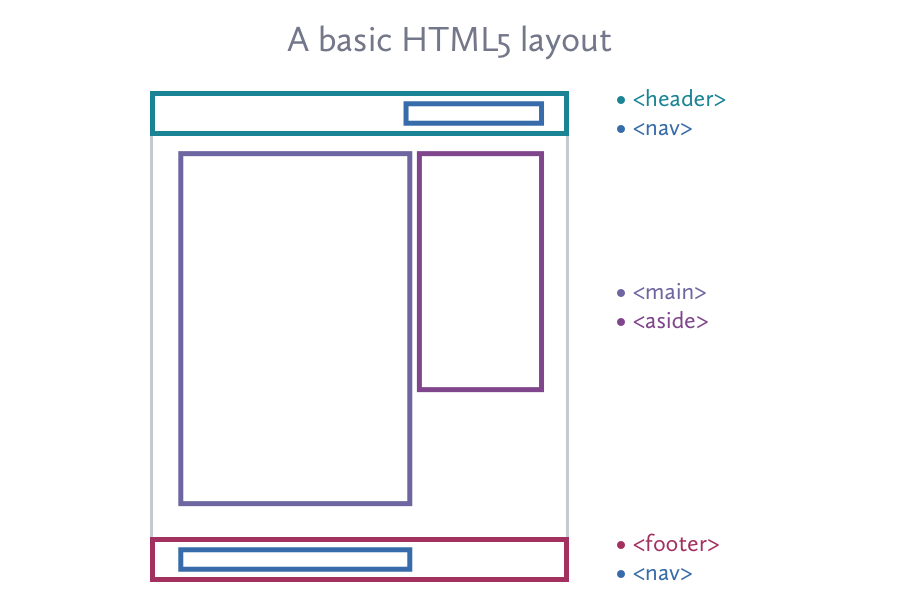
This image shows the inferred semantics of some HTML elements in terms of layout.
It is true that good CSS can make bad markup invisible to the average web user; but no amount of styling wizardry will make bad markup more meaningful to assistive technologies. Writing semantic markup is the only way in which you can make your website accessible to all visitors. Following this practice also has other benefits such as achieving higher search engine rankings and better interoperability with other web services.
How to Start Using Semantic Elements
We can group the semantic elements into four categories:
-
Document Structure: Document Structure HTML tags are things like header and provide semantic meaning about the layout of a website.
-
Textual Meaning: Tags like that tell a user or assistive technology that emphasis should be added to the tagged content.
-
Media Type:
-
Correlation: These tags tell the browser that certain elements are related to each other and must appear in a specific order, such as an <ol> tag.
Understanding these groupings and what each of the tags represents in terms of semantics is just the start. But being more aware of the tags and how they should be used will help you to be more mindful of using non-semantic elements like <div>and when there are semantic alternatives available.
Semantic markup is not “nice to have,” but is rather a cornerstone of Web development, because it is what enhances accessibility, search-ability, internationalisation and interoperability.
- Bruce Lawson
You can read more about semantic markup using this resource on html.com
Alternative Text for Images and Videos
Alt text (alternative text) is used within HTML to describe the appearance and function of an image on a page. Sometimes this information is also called “alt attributes” or “alt descriptions”, the primary purpose of alt text is to provide context for visually impaired users.
When using a screen reader alt text will be read aloud as a replacement for an on-page image. Additionally, alt text is loaded in place of images when the file cannot be found or loaded (due to poor connectivity); good use of alt text also provides better context to search engine crawlers which helps them to index images correctly.
Writing Good Alternative Text
There is a really nice example for use cases of alt text on Web AIM — which shows the importance of not repeating information and only providing the contextual information needed to replace what the image adds to the page. Another useful resource can be found at Moz.com, which focuses more on the ways in which good alt text can improve your SEO (Search Engine Optimisation).
Here’s a couple of tips on how to achieve good alternative text:
-
Keep it short — most screen readers cut off around 125 characters, so try not to exceed this.
-
**Don’t include “image of” or “picture of” **in your description (Gifs can be an exception here but we will talk a bit more about those later).
-
Never use images in place of words — search engines can’t read text within an image and using an image of a large block of text is harder to describe to screen readers, which could result in exclusion of people with a visual impairment as they will miss a lot context.
-
Don’t forget to use alt text on your buttons — this is especially important if you are using images as buttons. As the web has become more designed we have started to use icons and other visual representations on our websites, for someone using a screen reader there are no replacements for these and the user would be told the element is a “button” but with no other context of what happens when the button is pressed.
-
Use longdesc=”” where applicable - this allows longer descriptions for more complex images.
The Mozilla Developer Network (MDN) have a great resource on HTML and Accessibility which features a section on Text Alternatives. If you have the time I would recommend reading the resources on MDN for accessibility.
Using Empty Alternative Text
Something that is discussed in the MDN article on Text Alternatives is the use of empty alternative text.
When an image is used in a web page and the primary purpose of that image is for visual decoration, there isn’t a need to provide the context using alt text. However, if no alt text is provided, screen readers (and other assistive technologies) will go on to announce the whole image URL instead.
This is not ideal as it can break up the flow of a page when navigating using assistive technologies. A way around this happening is to provide empty alternative text like this alt=”” which will cause the screen reader to recognise the image but not attempt to describe it, they just say “image” instead. Another way to stop this is using the aria attribute role=”presentation”.
A side note here: If you are using images for decoration purposes only, you should include them in your CSS, not the HTML (if possible).
Alternative Text and Gifs
A little while back, a friend of mine asked me to review their alt text for some Gifs (Graphics Interchange Format) they had in a draft blog post. They had gone to great lengths to ensure their post was accessible and had some questions about how to contextualise what was happening in the Gif within their alt text.
Using Gifs as a visual accessory in blogs is something that is becoming more and more common. Especially in technical blog posts that describe the steps on how to do ‘X’ and then use a Gif as way of providing a visual walk through of those steps. The important thing to remember here is the context in which the Gif is used. If you are using a Gif as a visual accessory to your already thorough description of how to do ‘X’; using a long description or alt text field to describe what is happening in the Gif is like putting yourself on repeat. Not only will that be confusing but it will be extremely long to get through on a screen reader.
Additionally describing a Gif of user action is often badly translated to users that are navigating your website using assistive technology, as the description will be describing visual based interaction with your website and will therefore lack any context for anyone not using the visual UI.
When considering the alt text to use for a Gif, consider your context first. Here are some examples of good alt text for Gifs:
 A baby penguin moves across some ice on its stomach
Okay alt text: 
Better alt text:
Even better alt text:
With instructional Gifs, it is best just to provide context of what is happening within the Gif (avoid describing every action frame by frame).
 A user creates a new repository on github.com
Okay alt text: 
Better alt text:
Even better alt text:
Cascading Style Sheets
(CSS) and Aural Style Sheets (ACSS)
Cascading Style Sheets (CSS) plays the important part of shaping the visual appearance of our webpages, including putting any images that are purely for decoration in our CSS. But what are the best practices? And what is ACSS all about?
Here is a list of stuff to consider when you are creating the styling for your website:
-
Contrast: Check your contrast rating between backgrounds and text using a contrast checker. I am also a fan of this article on accessible contrast at viget.com, which provides links to many color contrast anaylzing tools.
-
**Setting background colours: **Setting your background colour is super important for maintaining a good contract rating over your website. Be mindful to also set background colour information behind images in case they don’t load or are purposefully not displayed.
-
Inverting Colours: This is becoming an increasing consideration and recently we have seen a surge in the popularity of creating a “Dark Mode” or version of web pages or apps. Having the option to tailor the colour selection can be really important for people with a visual impairment.
-
Allowing font-override (using relative lengths): Some users when browsing the web will set their default font-style and font-size. This can usually be done from the Tools or View menu items of the browser window. Sometimes this is set to override an styling choices made by web designers as a way of making the page more accessible to the user. This brings into question the use of relative measurements over fixed units in our CSS like pixels or cm. Because fixed units are an absolute size, they cannot change in response to user preferences. Evan Minto, from the Internet Archive, has a great post on evaluating use cases and switching to relative units - whilst it is a debated topic, rem and em are still seen as the most accessibility friendly units.
-
Minimising Motion/Animation: As websites have become more interactive, there have been many implementations of animation and motion, from backgrounds that move to scrolling and other event based animations. In terms of accessibility, this can be nauseating for some and render websites unusable for others. There is a way to allow your website to offer reduced or no motion for anyone that has this as a user preference using the prefers-reduced-motion media query - but this isn’t supported by all browsers yet. Read more about this media query here.
-
Scaling: How does your website look on a large scale display? Or on a screen where the user has scaled the resolution so everything displays larger than expected? It is important to think about the visual elements of your websites in this use case and what you might do to provide the most accessible UI (User Interface). There is a nice article on optimisation of websites for large-scale displays on css-tricks.com (please note this is not specifically related to accessibility).
-
Zoom: How does your website behave with zoom tools? Is there anything you can do to make the layout better in a “zoomed in” environment? How can you enable the design of your web pages to make zooming a feature that is possible to use without changing the usability? If you are married to the idea of vh and vw measurements in your website - what happens when someone wants to change this behaviour and zoom in or out on an element for accessibility reasons? It is really good to understand how to do zoom testing on your own webpages - there is some guidance here. Even more important to understand is that even with responsive web design - disabling the pinch to zoom behaviours of mobile web pages has negative implications for accessibility.
ACSS — Aural Style Sheets
Aural Style Sheets were brought about from the CSS3 specification and used a combination of speech synthesis and sound effects to make it possible for the user to listen to information as opposed to reading it.
Aural presentation had several proposed use cases: for blind people, to help users learning to read, assist users with reading problems, for home entertainment, in the car. A number of CSS attributes were provided for using Aural styles, such as voice-family, which developers could use to design how their web page would be read out to the user.
In reality however, users of screen reading technologies already have tools for doing this and individual preferences for the voice type, speed and dynamics of their screen reading tools. As developers we should not aim to change this, instead we should be focusing on making the elements more accessible to those technologies and allowing the user to browse our websites comfortably using their own audio preferences.
ACSS has now been removed from the web standards, and as such is in the process of being deprecated. The use of ACSS is now discouraged. However since the advent of Voice Assistants, new groups have been formed to help create standards and support those working on these kinds of technologies such as the Voice Assistant Standardisation Group. For communicating information about how your website should be read by Assistive Technologies, use WAI-ARIA.
Using WAI-ARIA
As mentioned WAI-ARIA is a technical specification that provides a framework to improve the accessibility and interoperability of web content and applications. Let’s take a look about how that works in practice.
Put more simply, ARIA defines a collection of attributes to help modify incorrect markup and to bridge gaps in HTML to create more accessible experience for those using assistive technology (AT).
- Carie Fisher from Deque.com [5].
As such it provides us with some tools for interoperability with screen reading technologies. In WAI-ARIA there are three main features that can help websites interface with Assistive Technologies:
-
Roles — these define what an element is or what it does. This can help identify landmarks within a web page, the document structure of the page and identify widgets.
-
Properties — these tell Assistive Technologies about object characteristics and relationships.
-
States or Values — these set out the current conditions or data values associated with the element.
Incorporating correct usage of these ARIA features ensures that users will have all the information that they need in order to use your website. Deque.com have a great article on using ARIA by Carie Fisher. Here’s a summary of Dos and Don’ts:
DO
-
Keep it simple — sometimes developers use too many ARIA attributes or the wrong attributes, keep it simple and only use ARIA where it is needed for providing greater context.
-
Use HTML & ARIA in combination — relying solely on HTML can mean important information about the purpose of elements is not communicated to assistive technologies.
-
When using ARIA — break the page into perceivable areas, assign landmark roles based on the type of content in the area. Note that when adding a label to a landmark the type of landmark should be considered and not repeated in the label (it will sound broken when read aloud, for example an <article> tag with the ARIA role=”article” will be read aloud as “article article”).
-
Test your implementation of ARIA — you can do this by navigating your website with keyboard focus and a screen reader, BUT if possible find and pay people who use Assistive Technologies (as this will give you a real user perspective).
-
Check out the practical support offered by W3C for using aria-label, aria-labelledby and aria-describedby.
DON’T
-
Use arbitrary labels for things — Bad use of ARIA is worse than no ARIA at all, be mindful of this when writing your website code.
-
Misuse HTML tags — this is important and is part of the second rule of ARIA created by W3C, you should avoid re-purposing elements and then using ARIA to fix the issues this may cause for accessibility.
-
Be mindful when using the ARIA role of application - when this is set it can stop Assistive Technologies from intercepting keystrokes and make the website less navigable for the user.
-
Set the ARIA role to be the same as the implicit HTML semantics — this results in redundant ARIA (see the W3C examples of this).
-
Use an ARIA role in your code without fulfilling the promise it infers.
Focus and Making Elements Focus-able
According to Web AIM keyboard accessibility is one of the most important aspects of web accessibility. There are many web users that rely on a keyboard to interact with websites. This isn’t limited to users with specific mobility limitations but visually impaired users also commonly use a keyboard for navigating the web.
Typically keyboard navigation is done through using the tab key to move through the interactive elements of a web page, including links, input text fields, buttons, etc. When a user tabs onto an item, that item has the “keyboard focus” meaning the user can activate or manipulate it using the keyboard. Keyboard focus determines which window or element will receive the input from the keyboard. There can only be one element at a time that has keyboard focus and the item with keyboard focus is visually highlighted to the user (through some kind of circle highlight or colour change).
When considering keyboard navigation of your website it is important to look at the way in which keyboard focus works. There are some specific things to learn about here.
**Navigation Order: **Default navigation order must be logical and intuitive — usually this means that it follows the visual order of the page. The navigation order (for keyboards and screen readers) is defined by the source code for your website — i.e. the structure of your HTML. Creating a website with HTML that doesn’t represent the logical order of the web page can have a huge impact on being able to navigate the page using keyboard input.
Focus Indicators: Focus indicators are important for sighted keyboard users as a visual indicator of where the keyboard focus is on a page. The basic focus indicator is provided automatically by the browser and is usually a border around the focused element. These focus indicators will be removed from any element with the CSS settings of outline: 0 or outline: none. This CSS setting should be avoided on any focusable element.
Avoid using colour alone to highlight focus, this can be detrimental to anyone who has a colour related visual impairment.
Note: You can add your own CSS to the focus indicator to make it more visually apparent and/or style it to match your design.
**Custom Widgets: **Elements that are natively keyboard accessible should be used where possible, however there are times in web development where custom widgets are necessary. If you are building a custom widget into your website you need to ensure that it will support keyboard accessibility. It must be presented in an intuitive and predictable way and any JavaScript event handlers must respond to a keyboard input and not just mouse input alone. For information about designing keyboard interactions with custom widgets you can take a look at the ARIA design patterns
Lengthy Navigation: Using long lists of links or other navigable items in your website may create problems for keyboard-only users. Unlike mouse users, keyboard users cannot visually scan a page and move immediately to the link they require, they must navigate through the interactive elements until they reach the one they wish to interact with. Implementing things such as a ‘skip to main content’ link can help in this scenario. Other best practices include using proper heading structure and providing correct ARIA landmarks or HTML structural elements to make the page easily navigable using a keyboard.
Auto-semantics
What are Auto-semantics?
In dictionary terms, auto-semantics occur when “a word or phrase is meaningful in isolation, independent of context”.
From this you might be able to understand how some developers appear to have adopted some auto-semantics for web elements. These semantics are largely influenced by the developments in operating systems or popular app products and are often featured in websites with the assumption that the user knows the expected interaction.
A common auto-semantic we have probably all experienced is the application of an underline to any text that is linked to another action. Whether that is an underlined phone number in emails that will automatically call on click, or a navigational link within a website, it is a common perception that if something is underlined it implies it can be interacted with.
An example of auto-semantics that developed from touch screen technologies is the “Pull-to-refresh” gesture which first appeared in 2008. This gesture has now become so universal that people implicitly expect it to be part of any mobile experience (and in all use cases whether that be a mobile application, a progressive web app or whilst in a mobile browser).
Whilst it can be seen from this example that some auto-semantics become widely adopted and even expected within a web experience, there are still many that aren’t widely adopted and leave the user unaware of the implied action. This is especially frustrating for users that navigate through assistive technologies as there are no instructions given to the assistive technology on how to interact with a web page.
Not only is there a severe lack of context in some of these features, but the actions also assume the users physical ability to conduct the action. For people with limited motor ability, shaky movements or that do not use their hands to interact with devices; these gestures can be quite impractical and almost unusable.
Therefore it is extremely important that context is provided, even if the action is seen to be implicitly understood. Providing context to assistive technologies and even allowing users to negate auto-semantics like pull to refresh, should be something that we are all thinking about when building stuff for the web.
That’s All Folks!
I hope that you’ve found this post informative and a helpful start in navigating accessibility on the web. You can chat to me about this and other web flavoured things on Twitter or Mastodon. ✨ 👋
Resources
Disclaimer:
This resource list is formed from the research I have done in preparing this post and as such, features articles and other resources that I personally have found to be useful. This doesn’t mean that these are THE ONLY resources nor does it say anything about the quality of other resources — there are many useful articles out there. Please feel free to add comments with suggestions of further reading on any of the topics listed.
Citations:
[1] Computer Access for People with Disabilities
[2] Accessibility Handbook (O’Reilly)
[4] WCAG section 1.1
Understanding Disability and the Web
-
Accessibility, Usability, and Inclusion: Related Aspects of a Web for All from W3C
-
Social Factors: Developing a Web Accessibility Business Case for Your Organisation from W3C
-
Accessibility is more than just supporting screen readers — Slides from a Talk by Seren Davies
The Guidelines for Web Accessibility
Accessibility Testing and Tools
Useful stuff for Development and Designing for Accessibility
-
British Dyslexia Association — Dyslexia Style Guide (see section 3 on website design).
-
Pa11y — free open source tools for designers and developers shout out to how nice their contribution guidelines are here
By Amy Dickens on October 23, 2018.