Human Friendly Colours using HSL
(If you are already familiar with HSL jump to the end for some fun tips.)
If you are a web developer you are probably accustomed to colours which look like this:
- #ff0000
- red
- rgba(255, 255, 255, 1)
The hexadecimal colours and the rgba colours use amounts of Red Blue Green to describe colours. This is a nice analogue to how the pixels in the screen are lighting up but it makes picking a colour not very human friendly.
A human way to think of colour asks questions like:
- Is it light or dark?
- What colour is it?
- Is it vibrantly coloured?
E.g. Dark Vibrant Blue or Light Pale Pink
There is a way of defining colours based on these propertiess which helps us adjust a colour lighter or darker or more colourful. Or more red or more blue.
This is HSL. In CSS it looks like this:
hsl(280deg, 80%, 80%)

hsl(280deg, 80%, 80%)
- H is hue, the colour it is described by an Angle between 0 and 360 degrees. Where 0 degrees is red, 120 degress is green, 240 degrees is blue. It is written like “[Number]deg”
- S is Saturation, it is how colourful it is. 0% is grey, 100% is maximum.
- L is lightness, 100% is white, 0% is black. 50% is the middle and has the most intense colour.
HSLA is similar, with an additional value between 0 and 1 for how transparent the colour is. E.g.
hsla(280deg, 0%, 50%, 0.8)
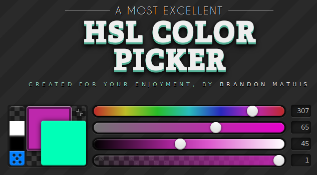
Brandon Mathis’s great HSL Color picker is a fun way to play with HSL colours: http://hslpicker.com/ (Thanks Matthew Graybosch for the tip!!)

Where it is handy
HSL is great for describing gradients!!
e.g. A gradient where instead of going from light to dark it goes from one colour to another by increasing the Hue by 30 degrees.
div {
background: linear-gradient(hsl(220deg, 80%, 80%), hsl(250deg, 80%, 80%))
}

linear-gradient(hsl(220deg, 80%, 80%), hsl(250deg, 80%, 80%))
It is great for having consistent colours that relate to eachother. In the example The type has the same hue as the body but just a very pale version.

div {
background-color: hsl(200deg, 100%, 32%);
color: hsl(200deg, 50%, 92%);
}
These two tips were taken from @UX_Grant on twitter’s amazing twitter moment full of little design tips:
Generating colors

Increasing the Hue by 10 degrees per box.
A nice property is that you can get colours of many hues which have a similar feel because they share the same saturation and lightness.
You can generate a set of nice distinct colours by rotating through the hue. In the example above we increase the hue by 10 degrees.
This has a nice rainbow effect.
Generating random colors
By setting the hue to a random angle between 0 and 360 degrees we will get a random selection of colors, this can be useful but sometimes you get the same colours close together which does not look so good.

Random Hues
A neat maths trick allows us to generate random appearing colours with fewer collisions.
Multiples of the golden angle (~137.6 degrees) has a nice property of landing on visually distinct points on the colour wheel where colours seldom colide.

Increasing the Hue by 137.5 degrees per box
function (el, i) {
el.style.background = ‘hsl(‘ + 137.50 * i + ‘deg, 80%, 80%)’;
}
Of course this property is maintained if you shift it round the colour wheel:

Same as before but the hue is roated by an additional 120 degrees.
‘hsl(‘ + 120 + (137.50 * i) + ‘deg, 80%, 80%)’
Hope this helps you make some nice colours!!
Tagged in Colors, Web Development, CSS, HTML, Design
By Ada Rose Cannon on August 24, 2017.
