
Success with CSS
Writing great CSS is an often overlooked and undervalued skill, especially when starting a project or hiring colleagues. Yet we’ve all worked on, or at least seen CSS that has absolutely run away with itself; thousand line long files with selectors nested four deep and splattered with !important.

The name I’ve heard for these is ‘chaotic style sheets’ and no one wants to deal with them. I’ve worked on projects that went through an entire redesign because the CSS was un-maintainable.
There are many tools and techniques available to us now as CSS developers that can help us to manage our CSS. There are pre and post processors, naming conventions, architectures, we’re even putting our CSS in our JS to try and keep things neat. So, what are the problems that we’re trying to fix? What tools can we use to make our CSS better?
The biggest gripe that developers have with CSS is its ‘global scope’. The problem is that when we link a CSS file, every selector therein could potentially apply to an HTML element on the page. The likelihood that we’ll accidentally target an element, overwrite a style or fall foul of a specificity issue is pretty high, and managing that all falls on the head of the css developer.
We can deal with the global scope by splitting the design and then the file structure up into modules or components. There are multiple tools available to us for this job -
CSS in JS
With the caveat that this requires your project to be using React, you could use the components that React already brings to your project to split up your CSS. Libraries such as Styled-Components, Emotion and Glamorous let the deveoper define our styles as part of their components, meaning that the styles are now scoped to the component and are no longer global. The component can be reused or deleted and its CSS will go with it. This makes maintenance much more simple. If we need to add or modify that component then we jump to its JS file and can feel safe in the knowledge that we’re not going to be accidentally affecting any other parts of the page.
BEM and SMACSS
If you’d rather not use CSS in JS, then there are still ways that you can take the idea of components and namespacing into your CSS. SMACSS (Scalable Modular Architecture for CSS) describes a process of dividing your design up into modules. Eg
Diving a design into modules
Once you’ve visually split up the design you can split your CSS up into separate files to reflect these separate modules. How you separate the modules is up to you but good rules are to consider reusability and the length of your css files, if you find them stretching to more than one scroll’s-worth, consider splitting the module into two.
BEM is a naming convention that can help with the management of your components, name the wrapping element for the component (or block), and then the child elements’ names are prepended by the name of that component, for example -

an example module from the design
.article {…}
.article__title {…}
.article__img–left {…}
.article__text {…}
By naming the classes this way it is clear, when looking at the CSS, which components are contained by which. By naming the components semantically it is possible to reason about the layout of the page and the markup without even seeing it, this makes for a much smoother process when adding new developers to the project.
Manage the size and maintainability of your files by keeping an eye on the lengths of the classnames created by BEM. If you find yourself using multiple double underscores then you might want to consider breaking the module up into smaller chunks.
Using BEM and SMACSS together will leave you with well named, navigable, small CSS files that you will be able to modify or delete with ease.
Least Specific Selector Means No Nesting!
The number one rule that you should be applying to your CSS is to always use the least specific selector that you possibly can to apply your styles. This usually means a single class selector, although it can mean applying styles directly to elements, if you know you’ll only ever have one of them on the page. By nesting your CSS selectors, either with a preprocessor or just by creating a chain of selectors, you’re instantly increasing the specificity of your selector. Increased specificity means that you could run into overwriting or cascade problems later down the line meaning that your selectors have to become more and more specific. Not only does this create CSS that is horrible to work on, but it creates larger CSS files, meaning a larger download for your users.
Unless you’re styling content that has come from somewhere where you have no control over the classnames/html, for example from a WYSIWYG editor, there is really no excuse, no nesting.
Use Variables, not your memory!
Your design probably has a set of colours, spacing and typography that are already defined as a theme, these should stay consistent throughout your CSS. These consistent themes, especially colours, can be difficult to remember, easy to typo and a pain to change when they’re dotted around your codebase.
Preprocessors such as SASS and LESS solved this problem by implementing variables.
With these tools we can assign a name to a colour or a spacing or font size and use that much more memorable name in our CSS as a value.
$primary-purple: #706cf5
$secondary-purple: #4c3f7f;
.link {
color: $primary-purple;
&:hover {
color: $secondary-purple;
}
}
The major drawback of preprocessor variables is that, since they are compiled into css, they can’t be changed at runtime, meaning they’re less useful for theming. The one upside being that because they’re compiled down to fully supported CSS, there will be no problems with browser support.
For those not using a preprocessor; CSS variables, or custom properties, are now available to us in most modern browsers. These work pretty much the same way as our preprocessor variables, you can assign a name to a value and use that name throughout your CSS.
:root {
–primary-purple: #4c3f7f;
}
.link {
color: var(–primary-purple);
}
Like the rest of your CSS, custom properties abide by the cascade, so if you set a variable, you can override it further down the cascade. As mentioned above, they can be changed at runtime meaning that if you change them with a media query or manipulate them with JS, the browser will repaint as necessary.
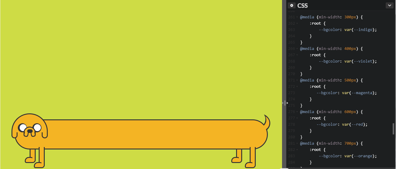
Changing the value of a variable with a media query
Not only does using variables make our lives easier in terms of no longer having to memorise strings of 6 character hex values (I can still remember the blue from my first web development job! 0590cd!) but it gives us a common language to use when talking to others about the design or the style guide.
Order your CSS Properties
This is a personal preference, but I find it easier to mentally parse what is happening in a style block that is ordered. When all of the blocks in the file follow this order it is much easier to find the parts that need changing.
My personal preference for order is a follows :
position (and left/top etc)
display
width
height
margin
padding
border
text/font styles
color
background color
css3 properties (transform, transition etc)
Others (opacity, z-index etc)
You can use a linter, such as CSS-Lint to check the order of your properties, or Prettier to auto format your CSS to make sure that everyone on the project follows the same ordering.
Work out a coding style that suits you and your project and stick to it
Even if you don’t want to, or are unable to apply any of these techniques, the best thing that you can do for your CSS is to make it standard. I once worked on a project where one developer liked all of their CSS properties in a line and one liked them stacked and they were constantly reformatting each other’s work. Not only is this a waste of time, but it makes version control a nightmare.
Decide on a standard, consider tabs vs spaces, property layout, property ordering, nesting length, naming conventions, file length, comments, z-index values, etc and define rules for each. Linters and pre commit hooks can help you and the rest of your team to stick to the rules.
What do we want? Maintainable, Scalable CSS! When do we want it? Yesterday, OMG!
These tips are meant as a guideline to help you to make your CSS more manageable. There is no one tool or rule which will give you perfect CSS, sadly, much of the work to keep the CSS sensible still falls on the heads of developers. CSS developers often memorise and internalise all kinds of rules and functionality of the styles they’re writing without even realising. This can make it much more difficult for people who are joining the project or, even worse, if they leave and take all of that knowledge with them.
Be kind to your colleagues and your future self and write great CSS!
Hi from the author! 🦄
Thanks for reading! I’m Jo, the newest addition to the Samsung Internet team I’m passionate about writing great, accessible, performant UX. I hope you find these CSS tips useful. Do tell me if you’re applying them to your projects, I’d love to hear about techniques and tools you’re using too. What’s your favourite successful CSS tip?
Tagged in CSS, Css In Js, Web Development
By Jo Franchetti on October 24, 2017.