Horizontally Scrolling Panes with clean HTML and modern CSS
This used to be a really hard problem, new CSS tools make it simpler. Here’s how it works…
Isn’t it nice when the tools you work with get better and better when you’re not looking? That’s what it feels like working in the Web some days.
Many years ago when I was still a front-end engineer on real products, I helped maintain a very popular newspaper site. It was one of the very early Web Apps designed to be responsive and touch first.
Since it was a newspaper the aesthetic had pages sat next to each other which could be swiped between with a flick of a finger.
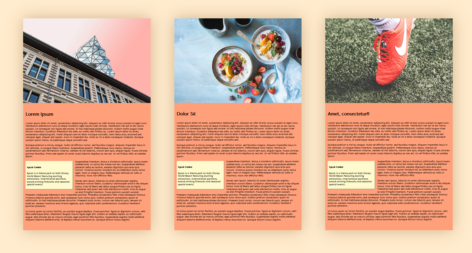
 3 Pages laid out horizontally
To implement this was a huge hack involving significant amounts of JavaScript and some really awkward HTML. It was flaky and sometimes suffered from poor performance, since we had to constantly track user input.
I tried remaking it for a project today and I was able to build the whole thing with only CSS!
Here’s how… (Demo at the bottom, direct link)
Step 1
The markup.
<body>
  <header>
    <h1>The Pink Paper</h1><h2>It's Salmon Actually</h2>
  </header>
  <nav><ul>
    <li><a href="#article1">Article 1</a></li>
    <li><a href="#article2">Article 2</a></li>
    <li><a href="#article3">Article 3</a></li>
  </ul></nav>
  <main>
    <article id="article1">Some content</article>
    <article id="article2">Some content</article>
    <article id="article3">Some content</article>
  </main>
</body>
We have 3 <article> which will contain our content.
We have a <nav> with 3 links, deep linking to the content we don’t want to break this behavior since it is useful for people who can’t scroll in two dimensions such as people using a mouse.
Step 2
Layout the
We will use CSS Grid to do that we will create a grid with the following properties.
-
New elements make new columns
-
Each column is the width of the available space
-
Each column fills the remaining height of the page
We will set the width and the height of the body and the html elements so that they fill viewport.
html,body {
  *width*: 100%*;
  height*: 100%;
  *margin*: 0;
}
Then we will layout our header our nav and our main using CSS Grid on the body
body {
  *display*: grid;
  *grid-template-columns*: 1fr;
  *grid-template-rows*: min-content min-content 1fr;
}
This makes the header and nav as small as possible ( min-content ) and gives the rest of the space to the main .
Now for the <article> elements. We will make another Grid on <main> to say they should all be laid out side by side each one taking up 100% of the width of the parent.
main {
*  display*: grid;
  *grid-template-rows*: 1fr;
  *grid-auto-flow*: column;
  *grid-auto-columns*: 100%;
}
We tell main to display with grid as before, we will set the the rows to take up all available space but we won’t set the number of columns since we could have any number of children. Instead we use grid-auto-flow: column; to tell it to add new columns when ever a new one has to be added and grid-auto-columns: 100%; to tell it that each new added column is 100% of the parent’s width.
Finally we will make it scroll by adding overflow-x: scroll; so that a scroll bar will always be present on that element and to allow it to scroll horizontally.
Step 3
This is okay but not really usable. We want to be able to scroll just the main element and to have the panes snap into place as the user scrolls. Thank fully there is a CSS API for this: CSS Scroll Snap which has really good support across browsers.
To use it we configure the parent’s scroll-snap-type and add snap points to it’s descendants using scroll-snap-align .
main {
  ...

  overflow-x: scroll;
  scroll-snap-type: x mandatory;
}

main > article {
  scroll-snap-align: start;
}
We’ve made it scroll in the x direction, and it will snap into place.
This is almost ready, the deep links in the <nav> still work but the instantaneous jumping to the pages is a poor user experience, to fix that we will add scroll-behavior: smooth; so that when we click on the links we get a smooth scroll to the page. This has no effect when the user is dragging with a finger or using a scroll wheel.
Final Demo
Try opening https://pink-paper.glitch.me in a mobile phone browser to try it with touch.
By Ada Rose Cannon on March 11, 2020.
