One UI to rule them all.
How the web can enable One UI across platforms

It was the 7th of November of 2018 and the Samsung Developer Conference’s (SDC) keynote was already on the way. Swarming with announcements, the atmosphere was dense with the promise of a next generation device and it was certainly building up expectations by the minute. Every single person in those chairs was looking for that single magical moment that would get them excited about what would come the year ahead, and some of us got surprised even before the foldable tease at the end.
It was around fifty minutes into the presentation when Jee Won Lee, a “Senior Designer of UX design” walked into the stage and stole the show by announcing a running year-long project her team had been working on: “a fundamental review of how people interact with their devices”. It sounded bold, they wanted a refresh, a “fundamental review”. They were moving their UX efforts from mostly adding new features to developing a comfortable and intuitive user experience their devices.
“It’s truly an honor to show you what we’ve come up with here at SDC. Ladies and gentlemen, I give you One UI” — Jee Won Lee
That was it for me. The highlight of the whole keynote. As a Graphical User Interface (GUI) nerd, they had given me that particle of hype to look forward to. Samsung finally had a design language and was moving to a coherent, functional and attractive solution. It’s was like Samsung’s M̶e̶t̶r̶o̶ M̶o̶d̶e̶r̶n̶ Fluent moment! OMG. It was like Samsung’s Material Design moment, the Human Interface Guidelines pinnacle for it’s new upcoming software! Bye bye Samsung Experience, hello One UI!
After the keynote I met back with colleagues and joked that we should do a CSS version of it. And we all know there is a grain of truth in every joke.
Several months passed by and with the general availability of Android P in Samsung devices One UI started rolling out to the masses. Reviews were mostly positive, with some of the biggest names in tech news stating it is “a full-featured, coherent, and (dare I say) thoughtful version of Android” and “easily Samsung’s most cohesive and visually impressive version of its operating system”.
The fellowship of the O (ne UI)
 Me asking Jo about CSS
Such a thoughtful design effort would be a great candidate to bring into the web, as a design language, and as a learning experience (I wanted to learn a bit more around CSS and get my hands dirty). I was only lucky that Jo Franchetti was around and willing to play adapting the visual guidelines to create some controls. A lot has — and hasn’t — happened ever since, but it’s my honor to announce that we have an initial experimental draft (I hope it’s clear enough that we are still working on it) on a CSS control library based on the One UI design language. The excitement gravitates around the idea that this can be the One UI to — as I constantly joked with Jo — rule them all: devices, applications, experiences. With the latest advancements in web technology like Progressive Web Apps (PWAs), Web Components and CSS Properties, it was a good idea to have a set of nice controls that could be used anywhere a browser can be found. Thus, we kinda became, the fellowship of the One UI.
Initial controls
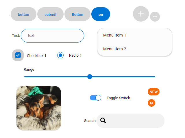
 Some of the controls present in One UI CSS
One UI CSS features a set of basic controls that allow developers to integrate the design language into their websites. Out of the box it offers buttons, textual input controls, menus, check boxes, radio buttons, sliders, toggles, badges and styles for images. If you have seen the latest GUIs on Samsung devices, you can immediately spot the similarities.
More controls are on their way, and with exciting technologies like Web Components already shipped in most browsers and new ones like CSS subgrid coming soon we expect to expand the range of assets available to developers with pre-built components and layouts coming in later versions. Much excite.
About the One UI CSS development

As Boromir wisely said, “one does not simply do a CSS control toolkit”. There are many parts involved and following we document some of the adaptations we made in order to make One UI a bit more webby.
Enhanced with accessibility in mind
We decided to tweak some colors and shapes in controls like checkboxes to make sure that they are compliant with WCAG 2 level AA. We’re also working towards continuing development and testing of more accessibility features built into the controls themselves.
Endless Customization
Another area where we are working on is enabling custom themes to be created. The base model for the One UI CSS color scheme expands on the theme creation of the color system in Material Design. Basically there’s a baseline palette on which all controls grab their appearance, and it’s easily swappable. The underlying tech for themes is based on CSS custom properties. They provide a flexible and powerful way of customizing the controls!
Open to all
The project is it’s infancy, and we invite everyone to collaborate. We envision custom layouts built with Grid, web components for more complex resusable controls, and more themes coming out from the community. The project is open source and you can find it and contribute here!
It’s the start of a long journey
We are making this first push knowing that there are still bugs to be ironed out, and more features and controls to come, but we’re happy to announce that it’s live and you can see a demo page that utilizes these controls here.
Let us know what you think and what you’d like to see coming forward, we’ll be paying attention and bringing more updates on the project soon! Stay tuned as well for documentation and explanation of each control in the UI toolkit.
By Diego González on June 13, 2019.
